Token Optix Branding
Industry
Finance
Client
Token Optix
Service
Graphic Design
Date
2024
Brand Overview
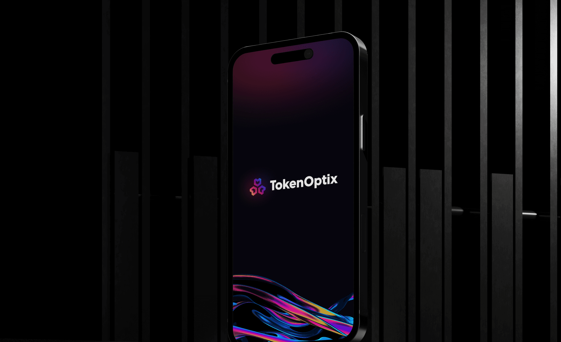
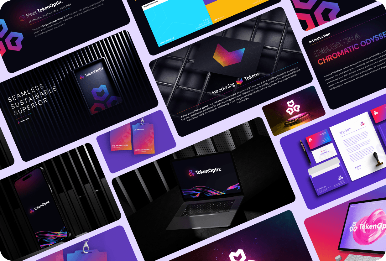
Token Optix’s brand refresh aims to modernize its visual identity, emphasizing innovation and cutting-edge solutions. The new design combines sleek typography, vibrant colors, and dynamic elements to reflect the brand’s forward-thinking ethos.
Typography
Hoglar Sans Display was selected for headings, offering a bold, modern feel that complements the tech-forward nature of the brand. Gotham is used for body text, ensuring readability and professionalism while balancing the impact of the display font.
Stylescape and Color Palette
The refreshed color palette integrates blue, purple, dark pink, and yellow on a dark background to create a dynamic, energetic look.
Blue symbolizes trust and technology.
Purple reflects creativity and innovation.
Dark Pink adds vibrancy and energy.
Yellow highlights key elements and contrasts with the darker tones.
Project Scope
The brand refresh includes a logo redesign to match Token Optix’s modern, innovative direction. Additionally, the updated visual elements are applied across stationery, ensuring consistency across all touchpoints.
Conclusion
The Token Optix brand refresh successfully modernizes the company’s visual identity, reinforcing its position as a leader in innovative solutions. Through the combination of bold typography, a vibrant color palette, and sleek design elements, the refresh captures the brand's forward-thinking ethos while ensuring consistency across all touchpoints. The updated logo and stationery further solidify Token Optix’s cutting-edge image, setting a strong foundation for continued growth and brand recognition.